
UX Research | UI Design | Information Architecture
Martello Investments, LLC Streamlined Onboarding & Portfolio Information Architecture
01
OVERVIEW
Context
My Role
• Lead UX Researcher
• UI Designer
• Design System Development
• Illustration
Duration
June 2023 - August 2023
Client
Martello Investments, LLC
Tools Used


Business Goals
Implementing client-facing tools to support business growth
Martello Investments, LLC is a small team that takes great pride in providing 1:1 financial planning services. Often times this means they are walking their clients through the onboarding process and spending a lot of time answering questions and sharing updates on portfolio performance.
With the hope of being able to expand to take on more clients, Martello approached the team with the objective of designing a custom onboarding system and investment portfolio portal for PC and mobile that clients could easily navigate and understand on their own.
Problem
Investors are overwhelmed
A constant theme that was present throughout the entire research phase was that many users are overwhelmed by investing and the current tools they have access to and therefore would rather hand the reins over to their wealth managers. Their main pain points were:
-
Investing feels intimidating and to some, inaccessible
-
Terminology related to investing is complex
-
Investors don't have time to educate themselves about investing
Solution
Creating a simplified platform with support options
To empower clients to independently onboard and review their portfolio's performance with Martello, regardless of their investing experience, we developed a streamlined onboarding process with step-by-step navigation and an investment portfolio portal featuring must-have tools, simplified information architecture, and clear access to flexible support options.
Onboarding

Investment Portfolio Portal

02
DISCOVER
Competitive Analysis
Investment companies have standardized the user experience
With our team's limited knowledge of investment tools, we had to take the time to educate ourselves on industry standards within the wealth management landscape. We kicked off our research by reviewing the dashboard content of several well-known investment companies to gain further insight into the current user experience.
At first glance, our team noticed that dashboards were quite similar in content, visuals, and navigation. As we dug deeper, we were also surprised by the overwhelming amount of content investors had access to within their portfolios. This left us wondering, is this what investors expect and find helpful?
Dashboard Content
List of Accounts
Performance
Summary
Insight Links


Dashboard Visuals
Information Icons
Lists
Graphs

_edited.png)

Navigation
Sub Navigation
Main Navigation
Dropdown Menus

Interviews
Most people invest and are confused by its complexity
Our team as a whole did not have much experience with investing so it wasn't a surprise that we were overwhelmed by investor dashboards. To better understand the experiences of others I developed a discussion guide that was used to interview 10 people ages 28-66 with varying levels of experience with investing.
As we reviewed the data a common theme emerged that regardless of experience with investing, all interviewees felt that they did not have a clear understanding of investing and were often confused by the complex terminology and often relied on support from wealth managers.
“The challenge I face is that investing seems complicated and over my head. I don’t have the time outside of work to learn it all."
James T. | Age 35
Survey
Most people who invest seek professional support
To help us understand if the sentiments shared by those we interviewed were representative of larger groups of people, I also led the effort to create an online survey to gain more quantitative data about user experiences with investing and financial institutions.

.png)
From the 44 survey respondents we learned:
Most respondents have worked with or currently work with a financial advisor or use an investment service.
When asked how respondents prefer to be supported during the initial process of setting up an investment account the top 3 responses were:
Personalized guidance | Step-by-step instructions | Interactive tools to help with investment decisions
When asked what features respondents find most valuable in an investment client portal the top 3 responses were:
• Performance tracking
• Goal setting
• Retirement income projection features
03
DEFINE
Persona
The adventurous explorer and aspiring retiree
To synthesize our user research and hone our focus on an MVP user, we developed the persona, The Adventurous Explorer & Aspiring Retiree. They are a 59-year-old accomplished professional with a successful career in marketing.
They have been diligent in saving for retirement and are now eagerly looking forward to the next chapter of their life. While they have a basic understanding of investing, they prefer to rely on the expertise of a wealth management company to handle their investments, allowing them to focus on their passion for travel and exploration.
_edited.png)
Goals & Needs
• Streamlined Retirement Planning
• Trustworthy Wealth Management
• Personalized Portfolio Viewing
• Seamless Onboarding Experience
Frustrations
• Retirement Income Optimization
• Complex Financial Jargon
• Advisors Focusing on Sales
So how might we:

Create an intuitive and user-friendly investment dashboard?

Help facilitate the ease of communication and information exchange to optimize convenience for both the client and advisor?

Make filling out forms, uploading documents, and other information exchanges painless for the client especially during the onboarding process?
04
DESIGN
Heuristic Evaluation
Current onboarding portal is not intuitive
To begin our design phase, we started with a deep analysis of Martello's current onboarding system made available through a 3rd party and pretty quickly we learned that there was a lot of room to grow.


Side Navigation Bar
The side navigation bar is only visible when clicked on making it hard for clients to understand where they are in the onboarding process.
Client Support
Options for support are hidden in side navigation bar and not clearly labeled.


Pop-ups
Pop ups with additional instructions, explanations, or information are vague or simply instruct the client to reach out.
Previous & Next Navigation
Previous and next navigation at the bottom right hand side of the page are small and are the only way to navigate through onboarding as the side navigation bar is not clickable.
Comparative Analysis
Translating complex processes into simple onboarding experiences
Although investors we interviewed shared some general details about the onboarding process when creating an online account, most could not remember specifics nor did they have access to the onboarding portal.
To better understand UI standards we looked at other types of onboarding processes for both PC and mobile.

Teal
• Task bar at top of page showing percentage completed
• Check marks to indicate what tasks you’ve completed
.png)


TurboTax
• Intuitive side bar navigation makes it clear where you are.
• Search & Help options in upper righthand corner
• Clickable links to “Learn more” available to help with client understanding.
Badoo
• Easy to navigate back an forth through onboarding via arrows
• Pages and verbiage are simple without UI clutter

Site Architecture
Creating streamlined dashboard site navigation with must-have features
Defining the site architecture was a crucial part of the process. We needed to organize the investor dashboard in an intuitive way that would balance user and business needs. Because our MVP user is not an investing expert, we decided to hone our focus on the essential-only features based on our research that aid in portfolio monitoring and information organization while using plain language as much a possible.


Sketching
Building with a mobile first mindset
Our team began to sketch and ideate with a mobile first mindset. This allowed us to hone in on the essential features that users expected to see when interacting with a wealth management platform. From asset allocation charts to up-to date news articles regarding investments, these preliminary drawings allowed us to explore design possibilities while addressing both user and business needs.

Wireframes
Incorporating portfolio monitoring into wireframes
Despite the desire to entrust their portfolio to a wealth manager, users wanted to monitor its performance. To provide peace of mind, we integrated portfolio performance tracking and asset allocation features.

Portfolio Performance
The performance chart allows Martello to be transparent about their handling of their client’s portfolio.
Asset Allocation
An asset allocation chart would also help the user understand how Martello invested their money.
.png)
Accounts Overview (v. 1)
Accounts Overview (v. 2)

Account Page
Trade History

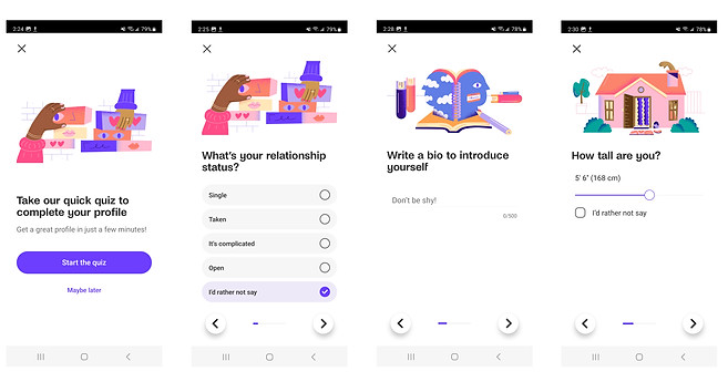
Onboarding process wireframes

Usability Testing
UI updates to eliminate confusion
After working through wireframes, we built our mid-fidelty prototype. To validate our design decisions we conducted usability testing on our mobile prototype to uncover any areas of frustration or confusion.

Can I scroll?
When asked to perform tasks on the Dashboard and Document screens, users were not aware they could scroll down the page due to lack of a visual affordance.

Where are the documents?
When toggling to the Documents page, users expressed that they expected the list of documents to be above the upload and take photo icons rather than having to scroll to see the list.

What's with all the buttons?
Users were confused by having a Next Page button and a Next navigation link at the top of the page. All users chose to press the Next Page button over the other option saying that it looks more official.
Additionally, users also expressed that they expected the Save button to be near the Next Page button at the bottom of the page especially so they don’t forget to save their work before moving on.
Design System
Aligning PC & mobile with Martello's brand visual
As a way to align onboarding and dashboard UI visuals I developed a design system. Although Martello did not have established brand guidelines, I drew inspiration from their existing site for color and typography as well as various UI kits found via Figma community.


05
DELIVER
Solution
Step-by-step navigation and information organization
Our user-centric onboarding system prioritizes simple step-by-step navigation and clear organization and navigation. By consolidating financial information into this platform, users can effortlessly onboard, organize, and share their information streamlining financial interactions with the team at Martello Investments, LLC.

Simplified financial summary
Our team developed an intuitive financial portal that provides users with a concise overview of their investments. Utilizing data visualizations and simplified language, users can confidently make informed decisions about their financial goals.

Easy access to support options
Although the main business goals were to empower Martello's clients to independently onboard and monitor their portfolios, users emphasized the importance of having access to support options. With this in mind we added key iconography and buttons to give clients quick access to email and scheduling in-person and phone call appointments.

Next Steps
The future of Martello's client portal
• Facilitate usability testing with PC prototype to uncover user pain points as we did for mobile.
• Work with Martello's software engineer to build out portal and support through launch.
• Track metrics to determine product success including total number of clients onboarded, number of clients who are able to complete onboarding independently, and ratio of clients who request support with portfolio monitoring vs. those who do not.
• Develop advisor portal to view client information.